How to Choose Restaurant Colors and Finishes That Feel Current in 2026
If you are choosing restaurant colors in 2026, the good news is that the trend direction is not a mystery box. The headline is pretty simple: warmer neutrals, more texture, and finishes that look real in daylight instead of pretending to be glossy showroom aliens.
Color and finish shape the first impression guests get before the food lands. They also affect how clean, calm, intimate, or lively a room feels. In other words, they do a lot of heavy lifting while everyone else is busy judging the lighting and the chairs.
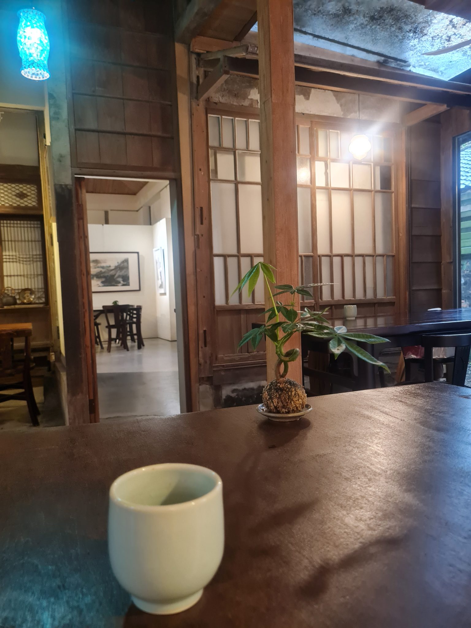
Why color and finish matter more than ever in restaurant design
The right palette helps a restaurant feel intentional. A soft clay wall, a muted olive banquette, or a matte wood stain can quietly signal comfort and confidence. The wrong combo can make even a well-run room feel flat, harsh, or a bit too “we bought the paint because it was on sale.”
Design coverage from Hospitality Design and ArchDaily points in the same direction: hospitality spaces are leaning warmer, more tactile, and more material-honest. That does not mean every restaurant needs beige everything. It means the best-looking rooms usually feel grounded, not overprocessed.
What’s current in 2026: warmer neutrals, tactile surfaces, and material honesty
The 2026 version of “neutral” is less icy gray, more soft sand, mushroom, taupe, oatmeal, smoke, and clay. These shades still feel modern, but they are less sterile under warm light. They also play nicely with wood grain, ceramic tile, brushed metal, and stone.
One useful idea is material honesty: let the surface look like what it is. If it is wood, let the wood read as wood. If it is ceramic, let it have that little bit of handcrafted variation. If it is metal, give it a finish that feels deliberate rather than shiny-for-the-sake-of-it.
That also fits the broader shift toward comfort and texture noted in recent hospitality coverage, including Hospitality Design’s recent trend coverage and ArchDaily’s work on texture and warmth in interiors.
How to match palette to concept: casual, upscale, neighborhood, or destination dining
Start with the kind of experience you want guests to feel, then choose colors that support it.
- Casual all-day dining: warm whites, soft greige, muted green, and natural oak. Friendly and unfussy.
- Upscale dining: deeper neutrals like charcoal, cocoa, oxblood, or forest green, balanced with stone and satin metal.
- Neighborhood restaurant: a familiar palette with one memorable accent, such as terracotta banquettes or a painted ceiling beam.
- Destination dining: a more distinctive palette, but still restrained enough that the food stays the star and the room does not start arguing with the menu.
A helpful rule: the more dramatic the concept, the more disciplined the rest of the palette needs to be. If the room has a bold statement wall, keep the surrounding finishes calm so the whole space does not turn into visual karaoke.
Finish choices that affect durability, cleaning, and perceived quality
Finish is where design meets reality. A matte surface looks elegant, but it may show wear differently than a satin one. Gloss can reflect light beautifully, but too much of it can make a room feel hard or busy. The best finish is rarely the prettiest sample under perfect showroom lighting. It is the one that still behaves after six months of lunch rushes.
| Finish | Best use | Main tradeoff |
|---|---|---|
| Matte | Walls, ceilings, some wood and stone | Can scuff or mark more easily |
| Satin | Most restaurant surfaces, banquettes, millwork | Less dramatic than matte or gloss |
| Gloss | Accent tile, bar fronts, feature details | Shows fingerprints and reflections fast |
For busy dining spaces, satin is often the safe middle ground. It gives you a bit of light bounce and still cleans up reasonably well. Matte works best where you want calmness and softness, especially on walls and ceilings. Gloss is best used like hot sauce: a little goes a long way.
Where to use matte, satin, gloss, wood, stone, metal, and ceramic accents
Think in zones, not just colors. A good restaurant interior usually mixes finishes on purpose.
- Matte walls: useful for dining rooms because they keep glare down and help people focus on food and faces.
- Satin millwork: a practical option for host stands, trim, and cabinetry.
- Gloss tile: best as a controlled accent behind bars, in wash areas, or on a small feature wall.
- Wood: adds warmth and makes a room feel human very quickly.
- Stone: brings weight and permanence, even in a modest amount.
- Metal: works well for edge details, lights, shelving, and subtle contrast.
- Ceramic: great for texture, especially when you want hand-finished character without turning rustic.
If you want a visual example, imagine a room with warm neutral walls, oak tables, a matte stone bar front, ceramic wall tile behind the service area, and a little brushed brass. That mix feels current without shouting about it.
Lighting and color: how the same finish changes under warm vs cool light
This is the part that catches people out. A color that looks creamy and calm in one light can look yellow or muddy in another. Warm light usually makes earthy tones feel richer and more inviting. Cool light can make whites crisper, but it can also flatten soft neutrals if you are not careful.
When possible, test paint, tile, and finish samples in the actual space at different times of day. Check them near windows, under pendant lights, and under the practical lighting you will use for service. Design magazines do not have to mop the floor. You do.
If you want a basic lighting reference, the U.S. Department of Energy’s LED basics guide is a sensible place to understand how light quality can influence color appearance in commercial spaces.
Common mistakes to avoid when chasing trends
- Choosing a trend without a use case. A palette that looks great in a moody bar might feel wrong in a family restaurant.
- Ignoring maintenance. Beautiful glossy surfaces can become fingerprint magnets at the exact moment you need calm.
- Overmatching everything. Too many finishes with the same sheen can make a room feel flat and artificial.
- Forgetting contrast. Guests need enough visual separation to read tables, seating, and circulation.
- Skipping sample testing. Always check colors in the real room before committing.
A simple decision checklist for owners, designers, and operators
Before you sign off on a palette, ask these questions:
- What do we want guests to feel in the first ten seconds?
- Which surfaces will take the most wear?
- How much cleaning time can the team realistically spend?
- Will this finish still make sense in daylight, evening service, and photos?
- Does the palette fit the menu, brand, and room size?
- Are we using at least one warm material and one tactile surface to keep the space from feeling flat?
If the answer to most of those is “yes,” you are probably close. If the room only looks good in one perfect render, it is probably not ready yet.
For more site context, see the home page, the about page, and the blog index. If you want to ask about a palette or finish direction, start at the contact page.