How to Choose the Right Color Scheme for Your Project
Color is the fastest shortcut to “this feels right.” When clients pick colors by vibe alone, projects can end up looking like they were assembled by committee. The good news: choosing a color scheme doesn’t have to be mystical—it’s a set of practical decisions you can make (and document) from the first draft.
When you search for color-scheme advice, you’re probably wondering: What colors actually work together? How do I choose shades that match the mood I want? and How do I avoid a scheme that looks great on screen but falls apart in real life? As the graphic design industry likes to say, color isn’t just decoration—it’s communication.
Color decisions matter because they influence perceived emotion, readability, and even what people think a product “means.” Learning the basics of color theory (and testing choices in context) helps you get consistency across branding, websites, packaging, or any visual deliverable. A strong starting point is WCAG’s guidance on contrast and readability.
By the end of this guide, you’ll be able to: pick a primary/secondary/accent structure, choose a palette that matches a goal mood, and run quick checks so your colors hold up from mockups to the final output.
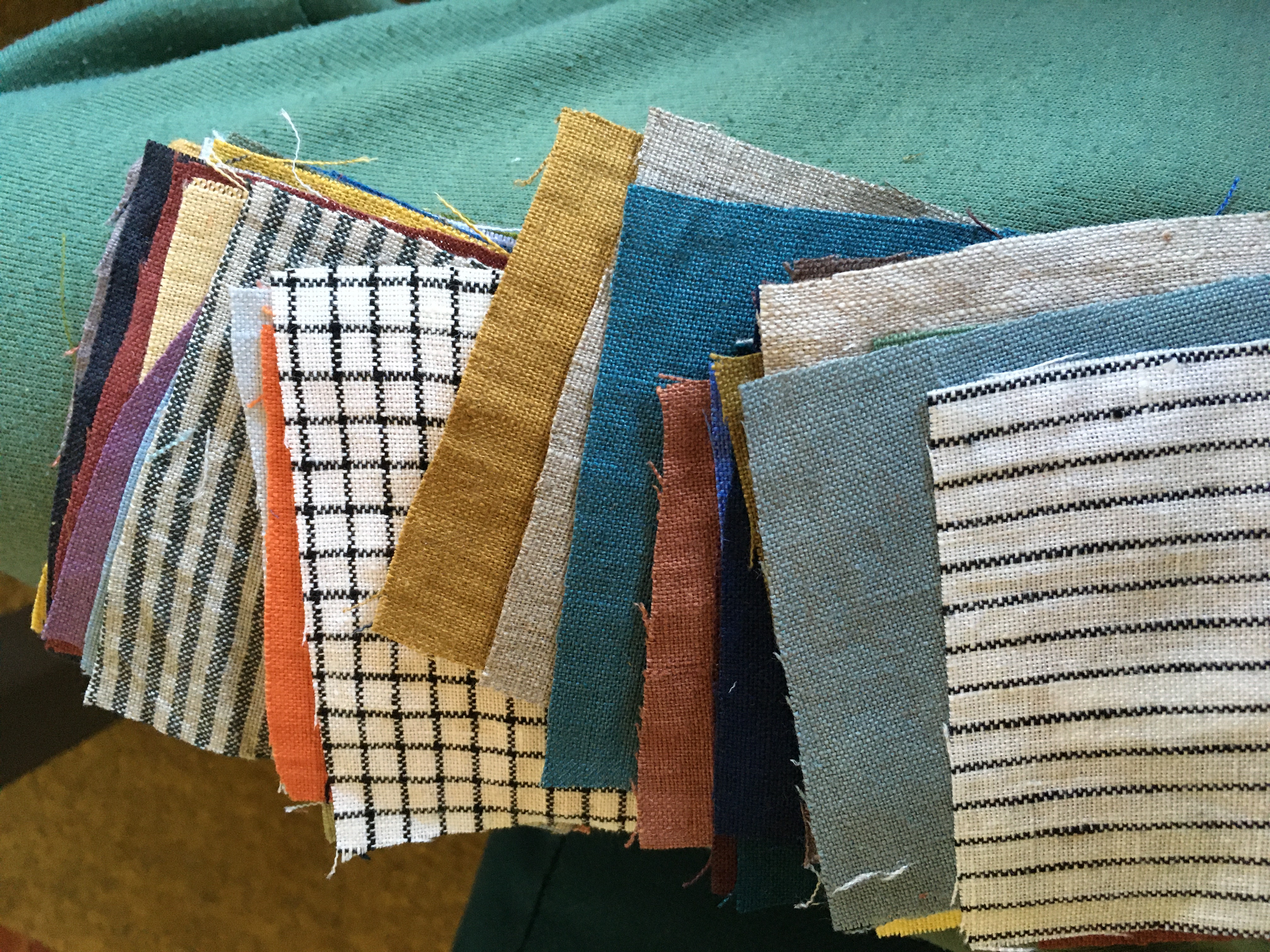
Understanding color theory basics
Let’s make the “color theory” part painless. You don’t need to memorize the entire color wheel like it’s a pop quiz—you need a few concepts that help you predict how colors will behave.
1) Hue, saturation, and brightness (the color triad)
- Hue is the “family” (red, blue, green).
- Saturation is how intense or muted it looks.
- Brightness (often called value) is how light or dark it is.
Two colors can share a hue but feel totally different if their saturation and brightness differ. This is why a palette can look “off” even when the hues look related.
2) Warm vs. cool—and why it affects mood
As a rough rule: warm hues (reds, oranges, yellows) tend to feel energetic or inviting, while cool hues (blues, greens, purples) tend to feel calm or focused. But the real magic happens when you pair warm/cool with brightness: a soft warm palette can feel gentle, while a bright cool palette can feel crisp.
3) Complementary, analogous, and triadic pairings
These are common ways to build “color relationships”:
- Analogous: neighboring hues (usually harmonious and easy to balance).
- Complementary: opposite hues (higher contrast, needs careful moderation).
- Triadic: three hues spaced evenly (dynamic, but you’ll want a dominant color).
If you’re picking for a real-world project (not just a wallpaper moodboard), start with analogous or a dominant hue + controlled contrast.
Want a reference you can keep handy? Color theory (overview on Wikipedia)?utm_source=kappou-nakagawa.com.
How colors affect mood and perception
Think of colors like a tone of voice. They influence how people read the “personality” of a design before they understand the words.
Readability isn’t optional: contrast is part of the palette
A beautiful color scheme can still fail if text and key UI elements don’t contrast enough. Use contrast checks early, especially for body text and important buttons. WCAG’s approach is a solid baseline if you’re building anything digital.
Resource: WCAG 2.1 Quick Reference?utm_source=kappou-nakagawa.com.
Perceived “temperature” and spacing
Light colors often feel more open; dark colors feel more grounded. If your palette feels heavy, try increasing brightness in the background neutrals or reducing saturation in the accent.
Consistency matters more than perfection
Clients tend to remember the overall vibe, not the exact hex codes. Your goal is to pick colors that behave consistently across materials and lighting conditions—screens, print, and real spaces.
Tips for choosing a color scheme
Here’s the part where you turn “vibe” into a repeatable plan.
1) Start with the job-to-be-done (what should people feel?)
Pick one primary emotion or goal, like: trust, calm focus, playful energy, or premium clarity. Then choose hues that match that temperature and brightness range.
2) Build your palette structure: base, support, accent
A practical scheme usually includes:
- Base (background): neutrals or a low-saturation hue.
- Support (secondary): another neutral or softer variant.
- Accent (action + highlight): one color that adds emphasis.
If you try to make everything “accent,” nothing stands out—and the design feels noisy.
3) Limit your saturation (especially for large surfaces)
High saturation is great for buttons or small highlights. For large areas (headers, backgrounds, big text blocks), muted saturation often looks calmer and more professional.
4) Make neutrals earn their keep
Neutrals aren’t just “gray.” They’re often where your scheme becomes cohesive. Choose neutrals that align with your accent undertone (slightly warm gray vs. cool gray), so the palette feels intentional.
5) Test in context, not just on a screen
If your project touches physical materials (signage, packaging, printed collateral), do a real test. This is where swatches beat theory every time.
Try-this-once action: pick your top two candidate palettes, then test them on a single “page” (or layout) with real text content, images, and the most important button. If you can’t decide after that, your palette probably needs fewer saturated accents, not “more searching.”
Common pitfalls to avoid
- Too many similar values → low hierarchy; everything looks equally important.
- Accent everywhere → no visual rhythm.
- Ignoring contrast → readability issues.
- Forgetting lighting → colors shift in different environments.
Examples of successful color combinations
Color schemes work best when they’re built for a purpose. Here are a few example patterns you can remix.
Example 1: Calm + trustworthy (cool base, muted accent)
- Base: soft blue-gray or near-neutral with a cool undertone
- Support: warm-enough neutral (to prevent “coldness overload”)
- Accent: restrained teal or indigo for key actions
Best for: services, help pages, documentation-style layouts.
Example 2: Energetic + friendly (warm base, brighter accent)
- Base: light warm neutral
- Support: slightly deeper warm shade for sections
- Accent: a vibrant orange or coral used sparingly
Best for: onboarding pages, feature highlights, callouts.
Example 3: Premium + focused (dark base, low-saturation accents)
- Base: deep neutral (charcoal or near-black)
- Support: medium gray with consistent undertone
- Accent: one restrained accent color (emerald, cobalt, or burgundy)
Best for: product-style visuals and bold, minimal interfaces.
If you’re mapping a bigger project, it can help to organize decisions in a structured way. For teams thinking about AI and digital workflow design, Flatlogic’s overview on AI integration services can be a useful reference when discussing how design systems connect to real workflows—though color still needs human taste and testing.
Quick checklist before you finalize
| Check | What “good” looks like |
|---|---|
| Hierarchy | Base/support/accents are clearly separated |
| Readability | Text and buttons have sufficient contrast |
| Consistency | Colors look coherent in both light and shadow (or on print) |
| Context test | Your real content looks good, not just empty layouts |
Need help deciding?
If you want a second set of eyes on your palette plan, start with details like intended audience, where the design will appear (digital, print, both), and the mood you’re aiming for. You can also browse related resources on the FAQ and explore more guides in the blog. When you’re ready, the services page is a good next step for figuring out what support looks like.